D3 visualisations

Thirty charts for the views a diagram notation cannot draw.

Some questions are not architecture diagrams. Where does the traffic actually go? Which modules import which? How is the spend nested? These are data visualisations, and PlantUML cannot draw them at all.

These are real D3 (JavaScript, not a DSL) executed in a sandboxed frame, so anything D3 can do is available rather than the subset a wrapper would expose.

When to use these

When not to

Common mistakes

Force-directed graphs are the most over-used chart in this list. They look impressive and are hard to read: node position carries no meaning, and the layout changes every run. Reach for an adjacency matrix when the question is "what depends on what", and keep the force graph for showing clusters.

The 30 templates

Sankey — request flow.d3

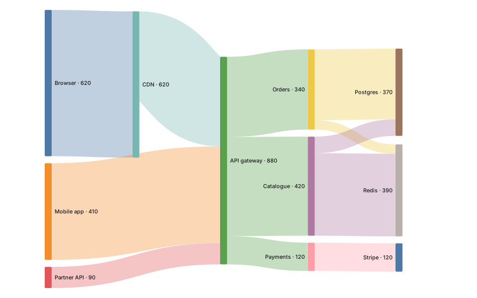
Flow with volume. The best chart here for "where does it all go".
Sankey — request flow: rendered example
Show the source
// Sankey — where traffic actually goes.
// Node ids are strings, so `nodeId` must be set; d3-sankey defaults to
// indices and would silently mis-wire the links.

const data = {
  nodes: [
    { id: 'Browser' }, { id: 'Mobile app' }, { id: 'Partner API' },
    { id: 'CDN' }, { id: 'API gateway' },
    { id: 'Orders' }, { id: 'Catalogue' }, { id: 'Payments' },
    { id: 'Postgres' }, { id: 'Redis' }, { id: 'Stripe' },
  ],
  links: [
    { source: 'Browser',     target: 'CDN',         value: 620 },
    { source: 'Mobile app',  target: 'API gateway', value: 410 },
    { source: 'Partner API', target: 'API gateway', value: 90  },
    { source: 'CDN',         target: 'API gateway', value: 380 },
    { source: 'API gateway', target: 'Orders',      value: 340 },
    { source: 'API gateway', target: 'Catalogue',   value: 420 },
    { source: 'API gateway', target: 'Payments',    value: 120 },
    { source: 'Orders',      target: 'Postgres',    value: 300 },
    { source: 'Orders',      target: 'Redis',       value: 40  },
    { source: 'Catalogue',   target: 'Redis',       value: 350 },
    { source: 'Catalogue',   target: 'Postgres',    value: 70  },
    { source: 'Payments',    target: 'Stripe',      value: 120 },
The rest of this template, and how to use it

Chord — service interaction.d3

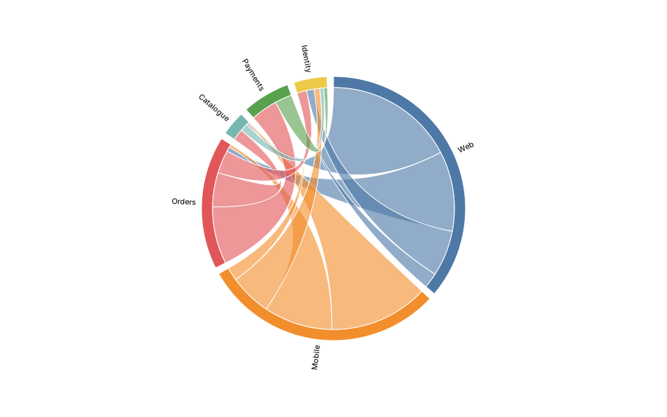
Who talks to whom, when the traffic is bidirectional.

Chord — service interaction: rendered example
Show the source
// Chord — who talks to whom, and how much.
// matrix[i][j] = calls per minute from names[i] to names[j].

const names = ['Web', 'Mobile', 'Orders', 'Catalogue', 'Payments', 'Identity'];
const matrix = [
  [  0,  0, 210, 340,  40, 120],
  [  0,  0, 180, 260,  35, 110],
  [ 12,  8,   0,  90, 150,  60],
  [  5,  4,  30,   0,   0,  20],
  [  0,  0,  70,   0,   0,  45],
  [ 20, 15,  25,  10,  10,   0],
];

const size = Math.min(width, height);
const outerRadius = size / 2 - 110;
const innerRadius = outerRadius - 16;

const color = d3.scaleOrdinal(names, theme.palette);
const arc = d3.arc().innerRadius(innerRadius).outerRadius(outerRadius);
const ribbon = d3.ribbon().radius(innerRadius);

const chords = d3.chord()
    .padAngle(0.05)
    .sortSubgroups(d3.descending)(matrix);

The rest of this template, and how to use it

Arc diagram — dependencies.d3

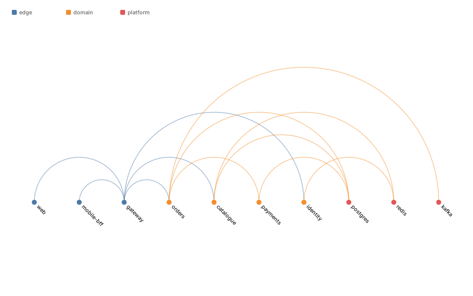
Nodes on one axis, arcs above. Readable where a force graph is not, provided the ordering means something.

Arc diagram — dependencies: rendered example
Show the source
// Arc diagram — a dependency list you can actually read.
// Nodes sit on one axis; each dependency is an arc. Grouping by `layer`
// and sorting by it makes cross-layer edges (the interesting ones) obvious.

const nodes = [
  { id: 'web',        layer: 'edge' },
  { id: 'mobile-bff', layer: 'edge' },
  { id: 'gateway',    layer: 'edge' },
  { id: 'orders',     layer: 'domain' },
  { id: 'catalogue',  layer: 'domain' },
  { id: 'payments',   layer: 'domain' },
  { id: 'identity',   layer: 'domain' },
  { id: 'postgres',   layer: 'platform' },
  { id: 'redis',      layer: 'platform' },
  { id: 'kafka',      layer: 'platform' },
];

const links = [
  ['web', 'gateway'], ['mobile-bff', 'gateway'],
  ['gateway', 'orders'], ['gateway', 'catalogue'], ['gateway', 'identity'],
  ['orders', 'payments'], ['orders', 'postgres'], ['orders', 'kafka'],
  ['catalogue', 'redis'], ['catalogue', 'postgres'],
  ['payments', 'postgres'], ['identity', 'redis'],
];

The rest of this template, and how to use it

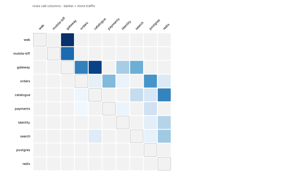
Adjacency matrix — coupling.d3

Adjacency matrix. Unfashionable, and better than a force graph for dense dependencies.

Adjacency matrix — coupling: rendered example
Show the source
// Adjacency matrix — the honest view of a dense graph.
// Past ~20 nodes a node-link diagram is a hairball; a matrix stays readable
// and makes clusters show up as blocks along the diagonal.

const names = [
  'web', 'mobile-bff', 'gateway', 'orders', 'catalogue',
  'payments', 'identity', 'search', 'postgres', 'redis',
];

// weight[i][j] = calls/min from names[i] to names[j].
const weights = [
  [ 0,  0, 90,  0,  0,  0,  0,  0,  0,  0],
  [ 0,  0, 70,  0,  0,  0,  0,  0,  0,  0],
  [ 0,  0,  0, 62, 84,  0, 31, 45,  0,  0],
  [ 0,  0,  0,  0,  8, 40,  6,  0, 55, 12],
  [ 0,  0,  0,  4,  0,  0,  0, 22, 14, 61],
  [ 0,  0,  0,  3,  0,  0,  5,  0, 18,  0],
  [ 0,  0,  0,  0,  0,  0,  0,  0,  9, 27],
  [ 0,  0,  0,  0, 11,  0,  0,  0,  7, 33],
  [ 0,  0,  0,  0,  0,  0,  0,  0,  0,  0],
  [ 0,  0,  0,  0,  0,  0,  0,  0,  0,  0],
];

const margin = { top: 110, right: 20, bottom: 20, left: 110 };

The rest of this template, and how to use it

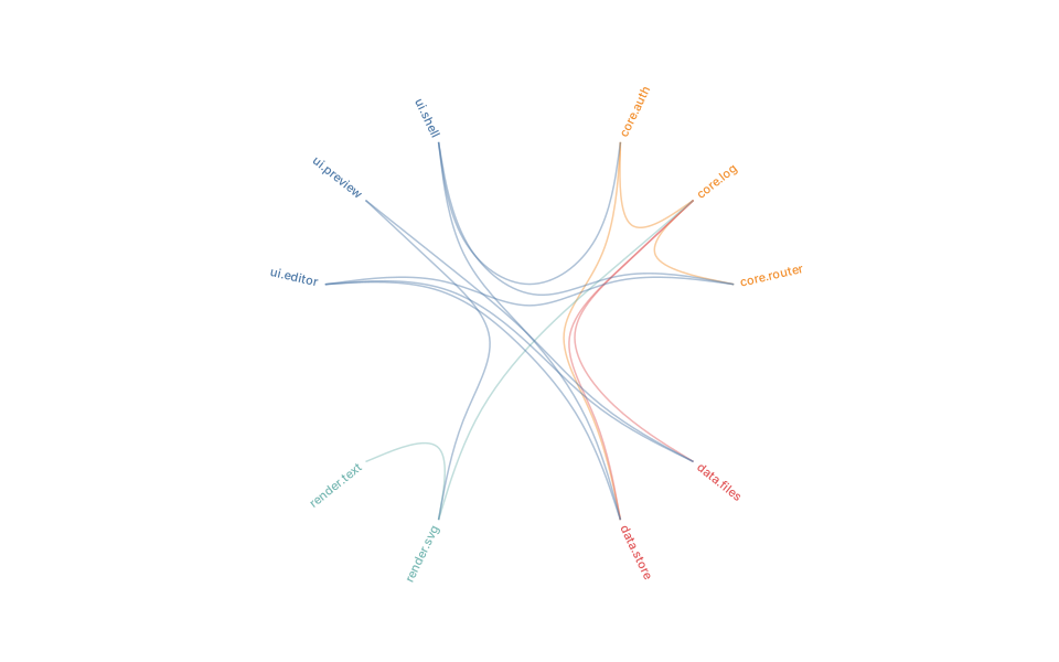
Edge bundling — module imports.d3

Hierarchical edge bundling. For import graphs big enough that straight edges become a hairball.

Edge bundling — module imports: rendered example
Show the source
// Hierarchical edge bundling — dependencies routed along the package tree.
// Bundling collapses parallel edges into visible cables, so "this package
// depends on half the codebase" reads as one thick strand instead of noise.

const data = {
  name: 'app',
  children: [
    { name: 'ui', children: [
      { name: 'ui.shell',   imports: ['core.router', 'core.auth', 'data.store'] },
      { name: 'ui.editor',  imports: ['core.router', 'data.store', 'data.files'] },
      { name: 'ui.preview', imports: ['data.files', 'render.svg'] },
    ]},
    { name: 'core', children: [
      { name: 'core.router', imports: ['core.log'] },
      { name: 'core.auth',   imports: ['core.log', 'data.store'] },
      { name: 'core.log',    imports: [] },
    ]},
    { name: 'data', children: [
      { name: 'data.store', imports: ['core.log'] },
      { name: 'data.files', imports: ['core.log'] },
    ]},
    { name: 'render', children: [
      { name: 'render.svg',  imports: ['core.log', 'render.text'] },
      { name: 'render.text', imports: [] },

The rest of this template, and how to use it

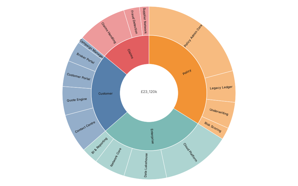
Sunburst — nested spend.d3

Nested hierarchy, radially. Prettier than an icicle, harder to compare.

Sunburst — nested spend: rendered example
Show the source
// Sunburst — a treemap that keeps the hierarchy legible.
// Angle is proportional to value, so a ring segment's width is its share of
// the parent. Good for "where does the money go" at two or three levels.

const data = {
  name: 'Portfolio',
  children: [
    { name: 'Customer', children: [
      { name: 'Quote Engine',      value: 1240 },
      { name: 'Broker Portal',     value: 890  },
      { name: 'Customer Portal',   value: 1120 },
      { name: 'Contact Centre',    value: 1680 },
      { name: 'Campaign Manager',  value: 260  },
    ]},
    { name: 'Policy', children: [
      { name: 'Policy Admin Core', value: 4820 },
      { name: 'Legacy Ledger',     value: 1360 },
      { name: 'Underwriting',      value: 1140 },
      { name: 'Risk Scoring',      value: 520  },
    ]},
    { name: 'Claims', children: [
      { name: 'Claims Handling',   value: 2140 },
      { name: 'Fraud Detection',   value: 680  },
      { name: 'Supplier Network',  value: 410  },

The rest of this template, and how to use it

Icicle — nested spend (linear).d3

A sunburst unrolled flat. Harder to love, much easier to compare siblings.

Icicle — nested spend (linear): rendered example
Show the source
// Icicle — a sunburst unrolled. Same data, but labels stay horizontal,
// which is the right trade when names are long.

const data = {
  name: 'Portfolio',
  children: [
    { name: 'Customer', children: [
      { name: 'Quote Engine',      value: 1240 },
      { name: 'Broker Portal',     value: 890  },
      { name: 'Customer Portal',   value: 1120 },
      { name: 'Contact Centre',    value: 1680 },
      { name: 'Campaign Manager',  value: 260  },
    ]},
    { name: 'Policy', children: [
      { name: 'Policy Admin Core', value: 4820 },
      { name: 'Legacy Ledger',     value: 1360 },
      { name: 'Underwriting',      value: 1140 },
      { name: 'Risk Scoring',      value: 520  },
    ]},
    { name: 'Claims', children: [
      { name: 'Claims Handling',   value: 2140 },
      { name: 'Fraud Detection',   value: 680  },
      { name: 'Supplier Network',  value: 410  },
    ]},

The rest of this template, and how to use it

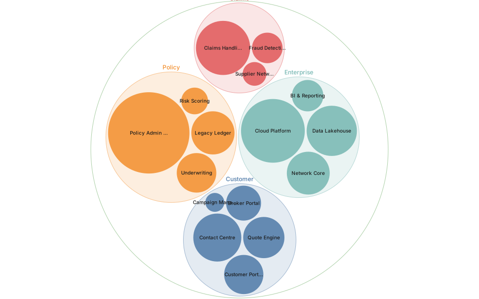
Circle packing — nested size.d3

Circle packing. Nested size when the nesting matters more than reading exact areas.

Circle packing — nested size: rendered example
Show the source
// Circle packing — nesting where relative *area* is the message.
// Weaker than a treemap for precise comparison, stronger for "which of these
// groups is enormous".

const data = {
  name: 'Portfolio',
  children: [
    { name: 'Customer', children: [
      { name: 'Quote Engine',      value: 1240 },
      { name: 'Broker Portal',     value: 890  },
      { name: 'Customer Portal',   value: 1120 },
      { name: 'Contact Centre',    value: 1680 },
      { name: 'Campaign Manager',  value: 260  },
    ]},
    { name: 'Policy', children: [
      { name: 'Policy Admin Core', value: 4820 },
      { name: 'Legacy Ledger',     value: 1360 },
      { name: 'Underwriting',      value: 1140 },
      { name: 'Risk Scoring',      value: 520  },
    ]},
    { name: 'Claims', children: [
      { name: 'Claims Handling',   value: 2140 },
      { name: 'Fraud Detection',   value: 680  },
      { name: 'Supplier Network',  value: 410  },

The rest of this template, and how to use it

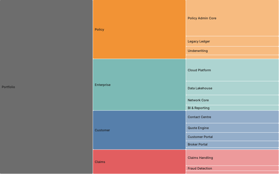
Treemap — portfolio cost.d3

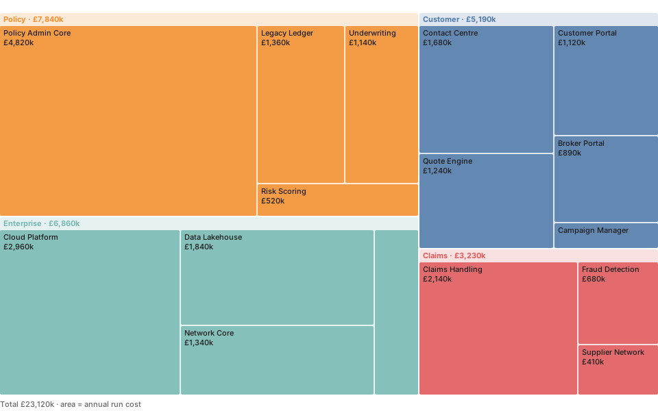
Nested size. Good for cost, storage, lines of code.

Treemap — portfolio cost: rendered example
Show the source
// Treemap — the default answer to "what do we spend IT on".
// `tile(d3.treemapSquarify)` keeps rectangles close to square, which is what
// makes areas comparable by eye.

const data = {
  name: 'Portfolio',
  children: [
    { name: 'Customer', children: [
      { name: 'Quote Engine',      value: 1240 },
      { name: 'Broker Portal',     value: 890  },
      { name: 'Customer Portal',   value: 1120 },
      { name: 'Contact Centre',    value: 1680 },
      { name: 'Campaign Manager',  value: 260  },
    ]},
    { name: 'Policy', children: [
      { name: 'Policy Admin Core', value: 4820 },
      { name: 'Legacy Ledger',     value: 1360 },
      { name: 'Underwriting',      value: 1140 },
      { name: 'Risk Scoring',      value: 520  },
    ]},
    { name: 'Claims', children: [
      { name: 'Claims Handling',   value: 2140 },
      { name: 'Fraud Detection',   value: 680  },
      { name: 'Supplier Network',  value: 410  },

The rest of this template, and how to use it

Tidy tree — structure.d3

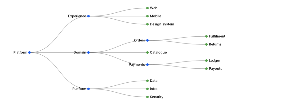
A tidy tree. The default for anything with one parent per node.

Tidy tree — structure: rendered example
Show the source
// Tidy tree — Reingold–Tilford. The layout for an org chart, a decision
// tree, or any structure where depth means something.

const data = {
  name: 'Platform',
  children: [
    { name: 'Experience', children: [
      { name: 'Web' }, { name: 'Mobile' }, { name: 'Design system' },
    ]},
    { name: 'Domain', children: [
      { name: 'Orders', children: [{ name: 'Fulfilment' }, { name: 'Returns' }] },
      { name: 'Catalogue' },
      { name: 'Payments', children: [{ name: 'Ledger' }, { name: 'Payouts' }] },
    ]},
    { name: 'Platform', children: [
      { name: 'Data' }, { name: 'Infra' }, { name: 'Security' },
    ]},
  ],
};

const root = d3.hierarchy(data);
const dx = 26;
const dy = (width - 200) / (root.height + 1);
d3.tree().nodeSize([dx, dy])(root);

The rest of this template, and how to use it

Radial tree — structure (radial).d3

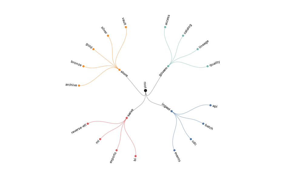
The same tree bent into a circle. Fits more depth on a slide, costs you easy comparison.

Radial tree — structure (radial): rendered example
Show the source
// Radial tree — the same layout as a tidy tree, wrapped into a circle.
// Fits far more leaves in the same pane; costs you the easy left-to-right
// read of depth.

const data = {
  name: 'root',
  children: [
    { name: 'ingest', children: [
      { name: 'events' }, { name: 'batch' }, { name: 'cdc' }, { name: 'api' },
    ]},
    { name: 'store', children: [
      { name: 'bronze' }, { name: 'silver' }, { name: 'gold' },
      { name: 'archive' }, { name: 'vault' },
    ]},
    { name: 'serve', children: [
      { name: 'bi' }, { name: 'ml' }, { name: 'reverse-etl' }, { name: 'exports' },
    ]},
    { name: 'govern', children: [
      { name: 'catalog' }, { name: 'lineage' }, { name: 'quality' },
      { name: 'access' },
    ]},
  ],
};

The rest of this template, and how to use it

Dendrogram — clustering.d3

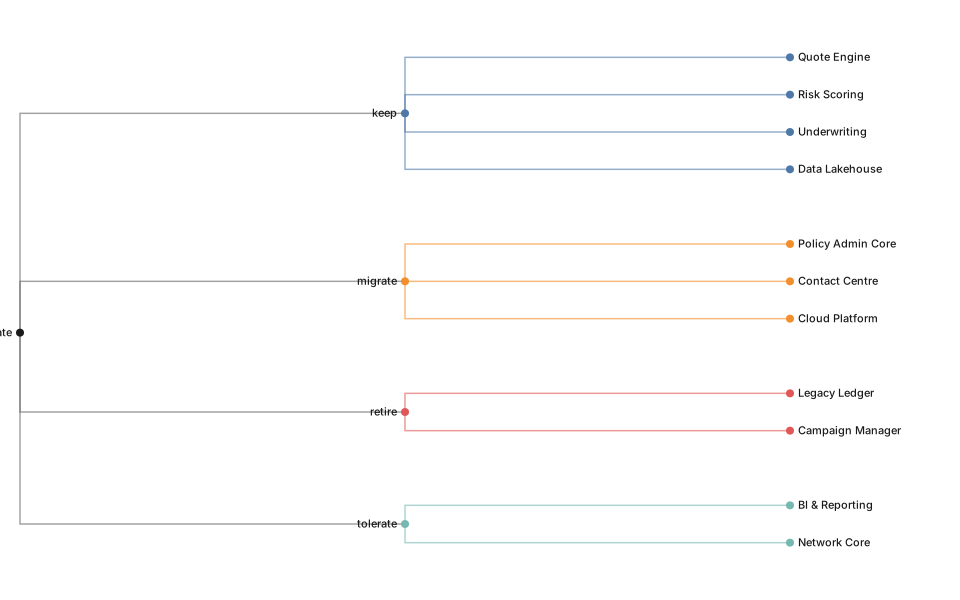
Clustering, with join height carrying the distance. Not merely a tree with curves.

Dendrogram — clustering: rendered example
Show the source
// Dendrogram (`d3.cluster`) — every leaf on the same line, so the picture
// reads as "how these group up" rather than "how deep each branch is".
// That is exactly the difference from `d3.tree`.

const data = {
  name: 'estate',
  children: [
    { name: 'keep', children: [
      { name: 'Quote Engine' }, { name: 'Risk Scoring' },
      { name: 'Underwriting' }, { name: 'Data Lakehouse' },
    ]},
    { name: 'migrate', children: [
      { name: 'Policy Admin Core' }, { name: 'Contact Centre' },
      { name: 'Cloud Platform' },
    ]},
    { name: 'retire', children: [
      { name: 'Legacy Ledger' }, { name: 'Campaign Manager' },
    ]},
    { name: 'tolerate', children: [
      { name: 'BI & Reporting' }, { name: 'Network Core' },
    ]},
  ],
};

The rest of this template, and how to use it

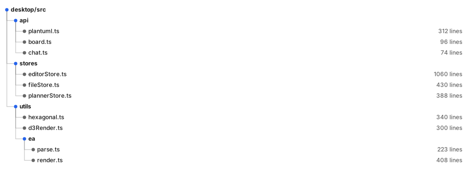
Indented tree — file/spec outline.d3

A file or spec outline. The chart that looks like the thing it describes.

Indented tree — file/spec outline: rendered example
Show the source
// Indented tree — a file explorer as a diagram. Every node gets its own
// row, so long names never collide and you can hang columns of metrics off
// the right-hand side.

const data = {
  name: 'desktop/src', children: [
    { name: 'api', children: [
      { name: 'plantuml.ts', size: 312 },
      { name: 'board.ts', size: 96 },
      { name: 'chat.ts', size: 74 },
    ]},
    { name: 'stores', children: [
      { name: 'editorStore.ts', size: 1060 },
      { name: 'fileStore.ts', size: 430 },
      { name: 'plannerStore.ts', size: 388 },
    ]},
    { name: 'utils', children: [
      { name: 'hexagonal.ts', size: 340 },
      { name: 'd3Render.ts', size: 300 },
      { name: 'ea', children: [
        { name: 'parse.ts', size: 223 },
        { name: 'render.ts', size: 408 },
      ]},
    ]},

The rest of this template, and how to use it

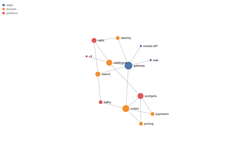
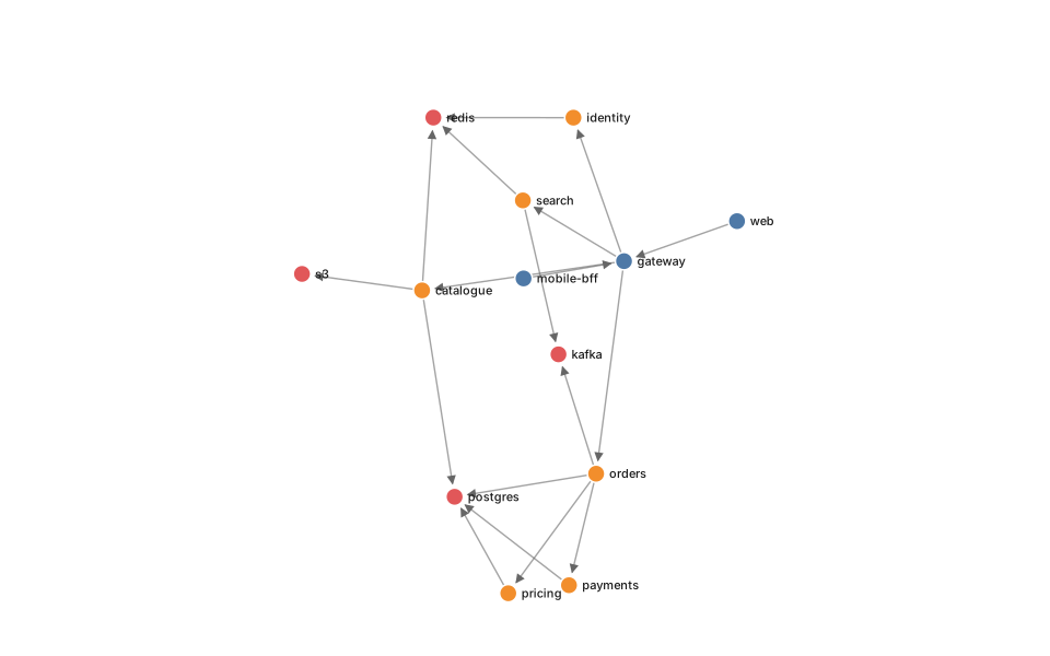
Force graph — service map.d3

Service map. Use for clusters, not for reading individual edges.

Force graph — service map: rendered example
Show the source
// Force-directed graph — the default service map.
// Node radius encodes degree, so the things everything depends on are the
// things that look important.

const graph = {
  nodes: [
    { id: 'web',        group: 'edge'     },
    { id: 'mobile-bff', group: 'edge'     },
    { id: 'gateway',    group: 'edge'     },
    { id: 'orders',     group: 'domain'   },
    { id: 'catalogue',  group: 'domain'   },
    { id: 'payments',   group: 'domain'   },
    { id: 'identity',   group: 'domain'   },
    { id: 'search',     group: 'domain'   },
    { id: 'pricing',    group: 'domain'   },
    { id: 'postgres',   group: 'platform' },
    { id: 'redis',      group: 'platform' },
    { id: 'kafka',      group: 'platform' },
    { id: 's3',         group: 'platform' },
  ],
  links: [
    { source: 'web',        target: 'gateway'   },
    { source: 'mobile-bff', target: 'gateway'   },
    { source: 'gateway',    target: 'orders'    },

The rest of this template, and how to use it

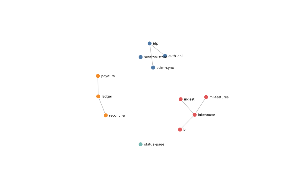
Force graph — disjoint clusters.d3

Force graph that keeps unconnected clusters apart rather than flinging them off screen.

Force graph — disjoint clusters: rendered example
Show the source
// Disjoint force graph — for a graph with more than one component.
// `forceCenter` only holds the *whole* system in place, so isolated islands
// drift off screen. Swapping it for forceX/forceY pins every component
// independently, which is the fix.

const graph = {
  nodes: [
    { id: 'auth-api',     group: 'identity' },
    { id: 'session-store', group: 'identity' },
    { id: 'idp',          group: 'identity' },
    { id: 'scim-sync',    group: 'identity' },

    { id: 'ledger',       group: 'finance'  },
    { id: 'payouts',      group: 'finance'  },
    { id: 'reconciler',   group: 'finance'  },

    { id: 'ingest',       group: 'data'     },
    { id: 'lakehouse',    group: 'data'     },
    { id: 'bi',           group: 'data'     },
    { id: 'ml-features',  group: 'data'     },

    { id: 'status-page',  group: 'orphan'   },
  ],
  links: [

The rest of this template, and how to use it

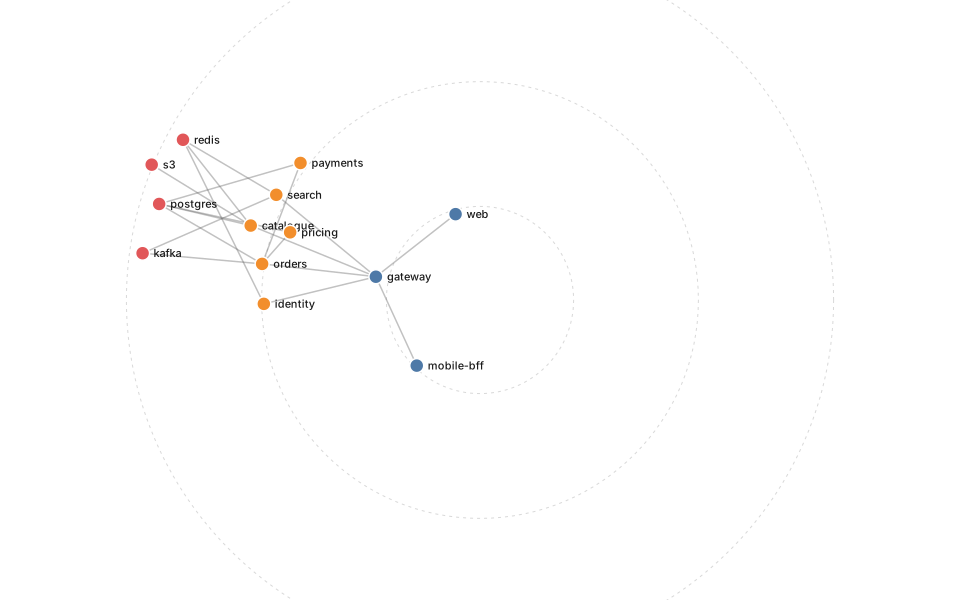
Force graph — radial tiers.d3

Force layout pinned to rings, so tier is a position instead of a colour legend.

Force graph — radial tiers: rendered example
Show the source
// Radial force layout — tiers as rings.
// `forceRadial` pulls each node to a ring chosen by its layer, so the
// picture encodes architecture (edge → domain → platform) instead of
// whatever the simulation happened to settle on.

const graph = {
  nodes: [
    { id: 'web',        group: 'edge'     },
    { id: 'mobile-bff', group: 'edge'     },
    { id: 'gateway',    group: 'edge'     },
    { id: 'orders',     group: 'domain'   },
    { id: 'catalogue',  group: 'domain'   },
    { id: 'payments',   group: 'domain'   },
    { id: 'identity',   group: 'domain'   },
    { id: 'search',     group: 'domain'   },
    { id: 'pricing',    group: 'domain'   },
    { id: 'postgres',   group: 'platform' },
    { id: 'redis',      group: 'platform' },
    { id: 'kafka',      group: 'platform' },
    { id: 's3',         group: 'platform' },
  ],
  links: [
    { source: 'web',        target: 'gateway'   },
    { source: 'mobile-bff', target: 'gateway'   },

The rest of this template, and how to use it

Directed graph — call direction.d3

Directed edges with arrowheads. For when direction is the question, not just adjacency.

Directed graph — call direction: rendered example
Show the source
// Directed graph with arrowheads — when direction is the point.
// Two details make arrowheads actually work: a `<marker>` with
// `orient="auto"`, and shortening each line by the target's radius so the
// head lands on the circle's edge rather than under it.

const graph = {
  nodes: [
    { id: 'web',        group: 'edge'     },
    { id: 'mobile-bff', group: 'edge'     },
    { id: 'gateway',    group: 'edge'     },
    { id: 'orders',     group: 'domain'   },
    { id: 'catalogue',  group: 'domain'   },
    { id: 'payments',   group: 'domain'   },
    { id: 'identity',   group: 'domain'   },
    { id: 'search',     group: 'domain'   },
    { id: 'pricing',    group: 'domain'   },
    { id: 'postgres',   group: 'platform' },
    { id: 'redis',      group: 'platform' },
    { id: 'kafka',      group: 'platform' },
    { id: 's3',         group: 'platform' },
  ],
  links: [
    { source: 'web',        target: 'gateway'   },
    { source: 'mobile-bff', target: 'gateway'   },

The rest of this template, and how to use it

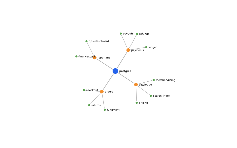
Force tree — blast radius.d3

Blast radius from one node: what breaks if this goes.

Force tree — blast radius: rendered example
Show the source
// Force-directed *tree* — a hierarchy relaxed rather than ranked.
// Feeding `root.links()` to a simulation gives the organic look of a mind
// map while keeping the parent/child structure exact. Distance by depth
// keeps the trunk short and the twigs loose.

const data = {
  name: 'postgres', children: [
    { name: 'orders', children: [
      { name: 'checkout' }, { name: 'fulfilment' }, { name: 'returns' },
    ]},
    { name: 'payments', children: [
      { name: 'ledger' }, { name: 'payouts' }, { name: 'refunds' },
    ]},
    { name: 'catalogue', children: [
      { name: 'search-index' }, { name: 'pricing' }, { name: 'merchandising' },
    ]},
    { name: 'reporting', children: [
      { name: 'finance-pack' }, { name: 'ops-dashboard' },
    ]},
  ],
};

const root = d3.hierarchy(data);
const nodes = root.descendants().map(d => ({

The rest of this template, and how to use it

Calendar heatmap — daily activity.d3

Daily activity over a year: deploys, incidents, commits.

Calendar heatmap — daily activity: rendered example
Show the source
// Calendar heatmap — a year of daily values, one cell per day.
// Weeks run across, weekdays down, which is the layout everyone already
// knows from commit graphs.

// Seeded so the sample looks the same on every render; swap this loop for
// your own [{date, value}] array.
const rng = d3.randomLcg(7);
const start = new Date(Date.UTC(2025, 0, 1));
const end = new Date(Date.UTC(2026, 0, 1));
const days = d3.utcDay.range(start, end).map(date => {
  const weekday = date.getUTCDay();
  const weekend = weekday === 0 || weekday === 6;
  const base = weekend ? 2 : 14;
  return { date, value: Math.round(base * (0.2 + rng() * 1.6)) };
});

const cell = 15;
const gap = 2;
const margin = { top: 46, right: 20, bottom: 20, left: 44 };

const colour = d3.scaleSequential([0, d3.max(days, d => d.value)], d3.interpolateGreens);
const weekOf = date => d3.utcSunday.count(d3.utcYear(date), date);
const boxWidth = margin.left + (weekOf(days[days.length - 1].date) + 1) * (cell + gap) + margin.right;
const boxHeight = margin.top + 7 * (cell + gap) + margin.bottom;

The rest of this template, and how to use it

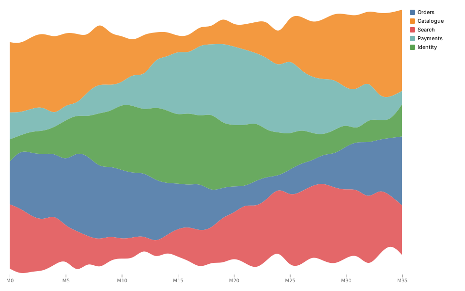
Streamgraph — shifting mix.d3

Shifting composition over time. Good for the mix, poor for reading any single value.

Streamgraph — shifting mix: rendered example
Show the source
// Streamgraph — a stacked area with a wiggle baseline.
// Good for how a *mix* shifts over time; bad for reading any single value,
// because no series sits on a fixed axis. Use a stacked area if the absolute
// numbers matter.

const keys = ['Orders', 'Catalogue', 'Search', 'Payments', 'Identity'];
const rng = d3.randomLcg(11);
const series = d3.range(0, 36).map(month => {
  const row = { month };
  keys.forEach((k, i) => {
    // A slow sine per series plus seeded noise, so the shape has structure
    // rather than looking like static.
    row[k] = Math.max(2, 40 + 30 * Math.sin((month + i * 6) / 5) + rng() * 18);
  });
  return row;
});

const margin = { top: 20, right: 130, bottom: 34, left: 20 };
const stacked = d3.stack()
    .keys(keys)
    .offset(d3.stackOffsetWiggle)
    .order(d3.stackOrderInsideOut)(series);

const x = d3.scaleLinear()

The rest of this template, and how to use it

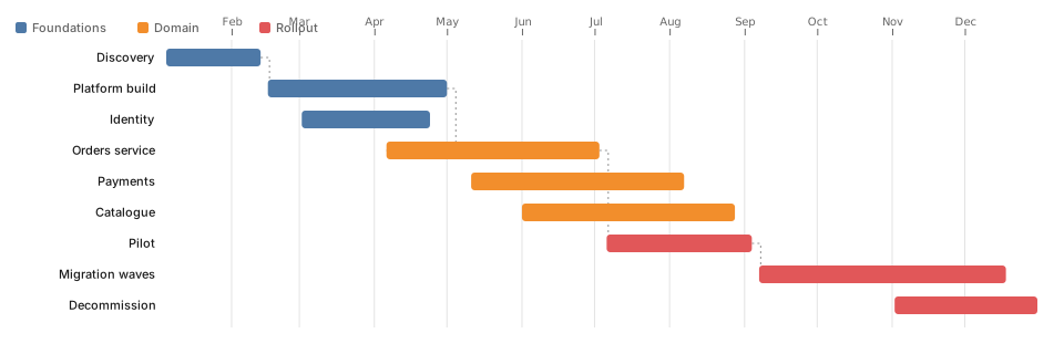
Gantt — delivery roadmap.d3

Delivery roadmap, rendered from data.

Gantt — delivery roadmap: rendered example
Show the source
// Gantt / roadmap — bars on a time axis, grouped by workstream.
// Dependencies are drawn as elbow connectors, which is what separates a
// roadmap from a list of coloured rectangles.

const tasks = [
  { id: 'discovery', stream: 'Foundations', label: 'Discovery',        start: '2026-01-05', end: '2026-02-13' },
  { id: 'platform',  stream: 'Foundations', label: 'Platform build',   start: '2026-02-16', end: '2026-05-01', after: 'discovery' },
  { id: 'identity',  stream: 'Foundations', label: 'Identity',         start: '2026-03-02', end: '2026-04-24' },

  { id: 'orders',    stream: 'Domain',      label: 'Orders service',   start: '2026-04-06', end: '2026-07-03', after: 'platform' },
  { id: 'payments',  stream: 'Domain',      label: 'Payments',         start: '2026-05-11', end: '2026-08-07' },
  { id: 'catalogue', stream: 'Domain',      label: 'Catalogue',        start: '2026-06-01', end: '2026-08-28' },

  { id: 'pilot',     stream: 'Rollout',     label: 'Pilot',            start: '2026-07-06', end: '2026-09-04', after: 'orders' },
  { id: 'migrate',   stream: 'Rollout',     label: 'Migration waves',  start: '2026-09-07', end: '2026-12-18', after: 'pilot' },
  { id: 'decomm',    stream: 'Rollout',     label: 'Decommission',     start: '2026-11-02', end: '2026-12-31' },
];

const parse = s => new Date(s + 'T00:00:00Z');
const rows = tasks.map((t, i) => ({ ...t, index: i, s: parse(t.start), e: parse(t.end) }));
const byId = new Map(rows.map(r => [r.id, r]));

const margin = { top: 44, right: 24, bottom: 24, left: 150 };
const rowHeight = 28;

The rest of this template, and how to use it

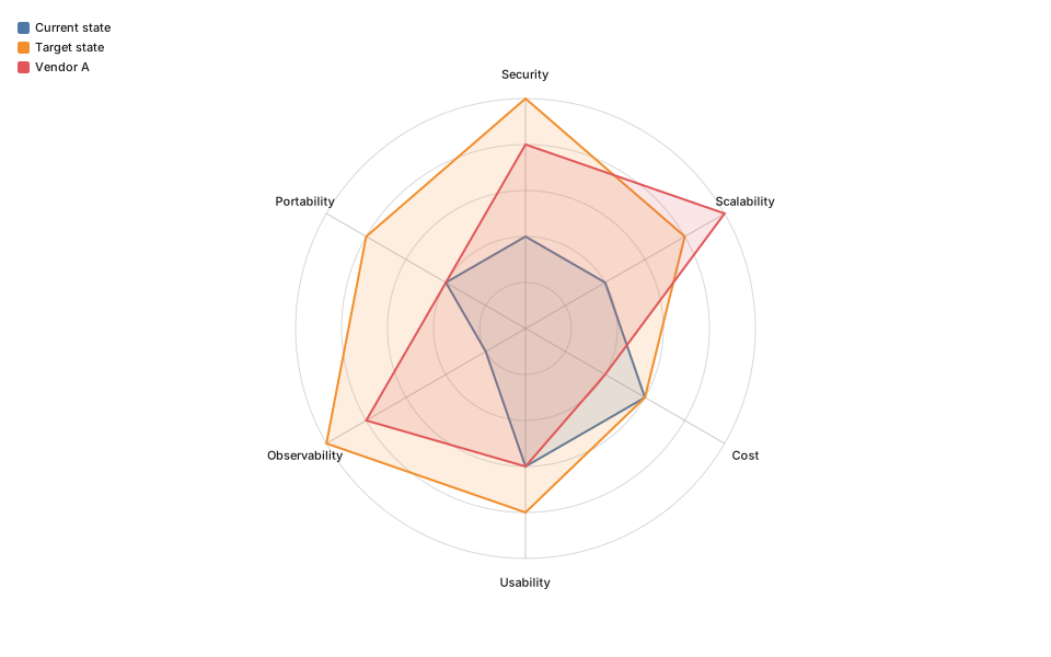
Radar — capability scoring.d3

Capability scoring across axes. Fine for one subject, misleading with four overlaid.

Radar — capability scoring: rendered example
Show the source
// Radar chart — several subjects scored on the same axes.
// Honest caveat: area is not meaningful (it changes with axis order), so use
// it for shape comparison, not for "which is bigger".

const axes = ['Security', 'Scalability', 'Cost', 'Usability', 'Observability', 'Portability'];
const subjects = [
  { name: 'Current state', values: [2, 2, 3, 3, 1, 2] },
  { name: 'Target state',  values: [5, 4, 3, 4, 5, 4] },
  { name: 'Vendor A',      values: [4, 5, 2, 3, 4, 2] },
];
const MAX = 5;

const radius = Math.min(width, height) / 2 - 90;
const angle = i => (i / axes.length) * 2 * Math.PI - Math.PI / 2;
const r = d3.scaleLinear().domain([0, MAX]).range([0, radius]);
const color = d3.scaleOrdinal(subjects.map(s => s.name), theme.palette);

const svg = d3.select(container).append('svg')
    .attr('viewBox', [-width / 2, -height / 2, width, height])
    .attr('width', width)
    .attr('height', height)
    .attr('font-family', 'system-ui, sans-serif')
    .attr('font-size', 11);

The rest of this template, and how to use it

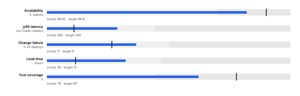
Bullet chart — target vs actual.d3

Target against actual, in one line. The chart a gauge wishes it were.

Bullet chart — target vs actual: rendered example
Show the source
// Bullet charts — Stephen Few's replacement for the dashboard gauge.
// Each row is: qualitative bands (poor/ok/good), a measure bar, and a target
// tick. Far more information per pixel than a dial, and directly comparable
// down the column.

const rows = [
  { label: 'Availability',   sub: '% uptime',   ranges: [99.0, 99.7, 100], measure: 99.82, target: 99.9 },
  { label: 'p95 latency',    sub: 'ms (lower=better)', ranges: [600, 350, 150], measure: 280, target: 200 },
  { label: 'Change failure', sub: '% of deploys', ranges: [30, 15, 0], measure: 11, target: 8 },
  { label: 'Lead time',      sub: 'hours',      ranges: [72, 36, 4], measure: 26, target: 12 },
  { label: 'Test coverage',  sub: '%',          ranges: [50, 70, 95], measure: 78, target: 85 },
];

const margin = { top: 30, right: 30, bottom: 20, left: 150 };
const rowHeight = 52;
const barHeight = 20;
const boxHeight = margin.top + rows.length * rowHeight + margin.bottom;

const bandFill = theme.mode === 'dark'
  ? ['#3a3a3a', '#4c4c4c', '#5e5e5e']
  : ['#e6e6e6', '#efefef', '#f7f7f7'];

const svg = d3.select(container).append('svg')
    .attr('viewBox', [0, 0, width, boxHeight])

The rest of this template, and how to use it

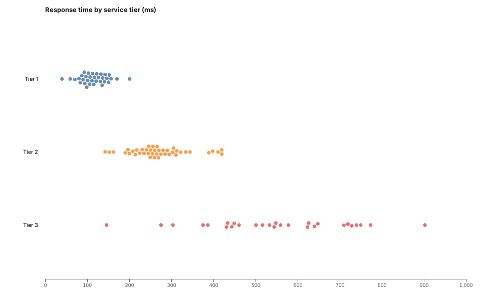
Beeswarm — distribution by group.d3

Every point, grouped, without the overplotting a strip plot suffers.

Beeswarm — distribution by group: rendered example
Show the source
// Beeswarm — every observation plotted, nudged apart so none hides
// another. A box plot shows you the summary; this shows you the shape,
// including the two outliers a box plot would reduce to dots.

const rng = d3.randomLcg(23);
const normal = d3.randomNormal.source(rng);
const groups = [
  { name: 'Tier 1', mu: 120, sigma: 30, n: 34 },
  { name: 'Tier 2', mu: 260, sigma: 70, n: 42 },
  { name: 'Tier 3', mu: 520, sigma: 160, n: 28 },
];

const points = groups.flatMap(g => {
  const draw = normal(g.mu, g.sigma);
  return d3.range(g.n).map(() => ({ group: g.name, value: Math.max(20, draw()) }));
});

const margin = { top: 40, right: 30, bottom: 44, left: 90 };
const x = d3.scaleLinear()
    .domain([0, d3.max(points, d => d.value)]).nice()
    .range([margin.left, width - margin.right]);
const y = d3.scalePoint()
    .domain(groups.map(g => g.name))
    .range([margin.top + 30, height - margin.bottom - 20])

The rest of this template, and how to use it

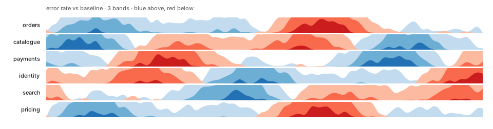
Horizon chart — many series, little space.d3

Many series in little space. Takes a moment to learn, then very dense.

Horizon chart — many series, little space: rendered example
Show the source
// Horizon chart — the answer to "I have 12 time series and one screen".
// The series is folded into N bands and each band overplotted at increasing
// saturation, so each row needs a fraction of the height a line chart would.
// Reading exact values is harder; spotting *when* things went wrong is much
// easier.

const BANDS = 3;
const rng = d3.randomLcg(5);
const names = ['orders', 'catalogue', 'payments', 'identity', 'search', 'pricing'];
// Every series is drawn BANDS times over, twice (above and below), through
// `curveBasis` — so the emitted path data grows as points × series × bands × 2.
// 6 × 80 keeps the SVG in the tens of KB; pushing both up an order of
// magnitude is what turns a horizon chart into a megabyte of <path>.
const points = 80;

const series = names.map((name, i) => ({
  name,
  values: d3.range(points).map(t =>
    30 * Math.sin((t + i * 14) / 11) + 18 * Math.sin(t / 4.5) + rng() * 14 - 7),
}));

const margin = { top: 34, right: 20, bottom: 20, left: 90 };
const rowHeight = 30;
const boxHeight = margin.top + series.length * (rowHeight + 3) + margin.bottom;

The rest of this template, and how to use it

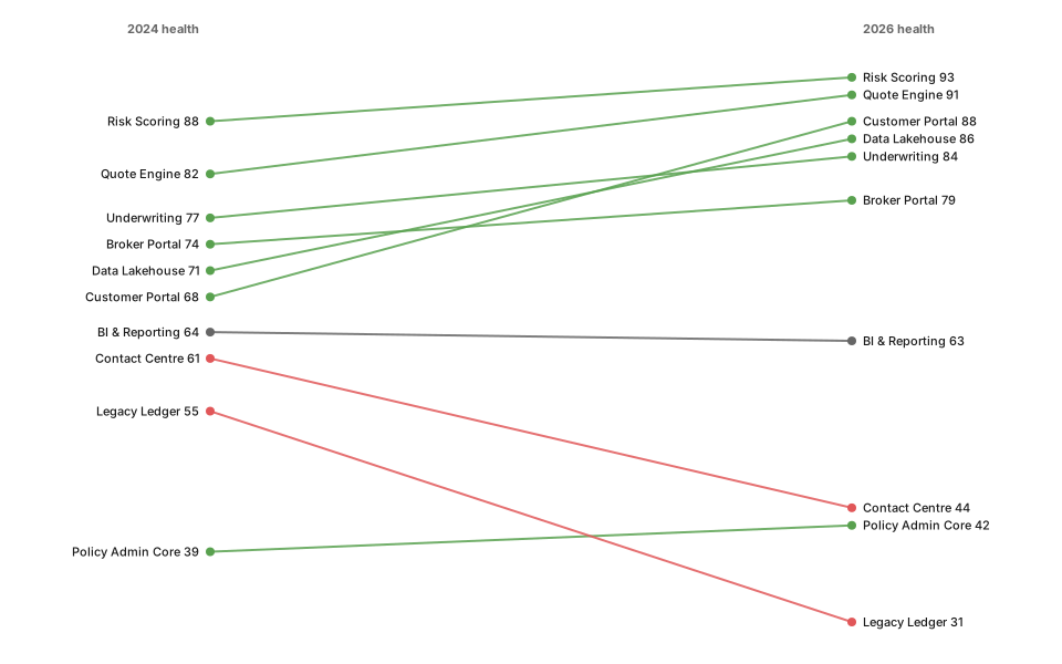
Slope chart — before and after.d3

Before and after, two points, one line each. Devastatingly clear.

Slope chart — before and after: rendered example
Show the source
// Slope chart — two points in time, one line each.
// The whole message is in the direction of the slopes, so colour by
// improvement/regression and let everything else recede.

const rows = [
  { name: 'Quote Engine',      before: 82, after: 91 },
  { name: 'Broker Portal',     before: 74, after: 79 },
  { name: 'Customer Portal',   before: 68, after: 88 },
  { name: 'Contact Centre',    before: 61, after: 44 },
  { name: 'Policy Admin Core', before: 39, after: 42 },
  { name: 'Legacy Ledger',     before: 55, after: 31 },
  { name: 'Underwriting',      before: 77, after: 84 },
  { name: 'Risk Scoring',      before: 88, after: 93 },
  { name: 'Data Lakehouse',    before: 71, after: 86 },
  { name: 'BI & Reporting',    before: 64, after: 63 },
];

const margin = { top: 54, right: 190, bottom: 30, left: 190 };
const y = d3.scaleLinear()
    .domain(d3.extent([...rows.map(d => d.before), ...rows.map(d => d.after)])).nice()
    .range([height - margin.bottom, margin.top]);
const xLeft = margin.left;
const xRight = width - margin.right;

The rest of this template, and how to use it

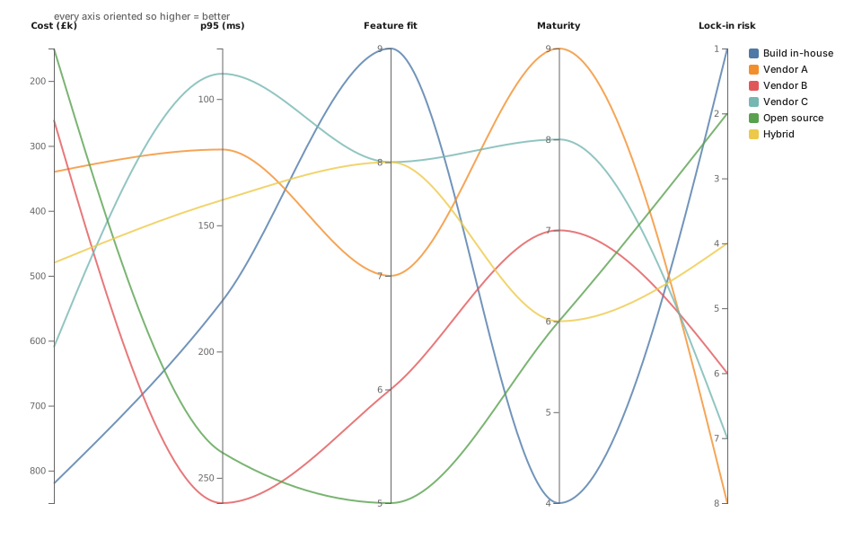
Parallel coordinates — multi-criteria.d3

Multi-criteria comparison: for option analysis.

Parallel coordinates — multi-criteria: rendered example
Show the source
// Parallel coordinates — one line per option, one vertical axis per
// criterion. The tool for "we scored six vendors on five dimensions"; crossing
// lines between two axes mean those criteria trade off against each other.

const dimensions = [
  { key: 'cost',     label: 'Cost (£k)',    invert: true  },
  { key: 'latency',  label: 'p95 (ms)',     invert: true  },
  { key: 'coverage', label: 'Feature fit',  invert: false },
  { key: 'maturity', label: 'Maturity',     invert: false },
  { key: 'lockIn',   label: 'Lock-in risk', invert: true  },
];

const options = [
  { name: 'Build in-house', cost: 820, latency: 180, coverage: 9, maturity: 4, lockIn: 1 },
  { name: 'Vendor A',       cost: 340, latency: 120, coverage: 7, maturity: 9, lockIn: 8 },
  { name: 'Vendor B',       cost: 260, latency: 260, coverage: 6, maturity: 7, lockIn: 6 },
  { name: 'Vendor C',       cost: 610, latency:  90, coverage: 8, maturity: 8, lockIn: 7 },
  { name: 'Open source',    cost: 150, latency: 240, coverage: 5, maturity: 6, lockIn: 2 },
  { name: 'Hybrid',         cost: 480, latency: 140, coverage: 8, maturity: 6, lockIn: 4 },
];

const margin = { top: 54, right: 150, bottom: 40, left: 60 };
const x = d3.scalePoint()
    .domain(dimensions.map(d => d.key))

The rest of this template, and how to use it

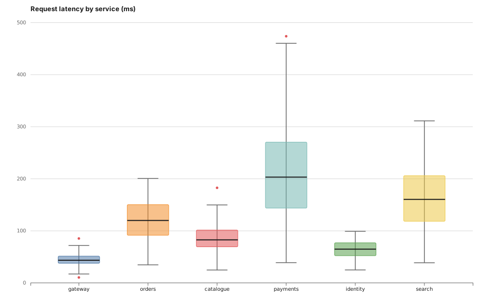
Box plot — latency distribution.d3

Latency distribution. The chart that shows the tail a mean hides.

Box plot — latency distribution: rendered example
Show the source
// Box plot — median, quartiles, 1.5×IQR whiskers, outliers plotted.
// Compact enough to line up a dozen services side by side, which is what a
// mean-and-error-bar chart cannot honestly do.

const rng = d3.randomLcg(31);
const normal = d3.randomNormal.source(rng);
const services = [
  { name: 'gateway',   mu: 45,  sigma: 12 },
  { name: 'orders',    mu: 120, sigma: 40 },
  { name: 'catalogue', mu: 80,  sigma: 25 },
  { name: 'payments',  mu: 210, sigma: 90 },
  { name: 'identity',  mu: 60,  sigma: 18 },
  { name: 'search',    mu: 150, sigma: 55 },
];

const groups = services.map(s => {
  const draw = normal(s.mu, s.sigma);
  const values = d3.range(60).map(() => Math.max(5, draw())).sort(d3.ascending);
  const q1 = d3.quantile(values, 0.25);
  const median = d3.quantile(values, 0.5);
  const q3 = d3.quantile(values, 0.75);
  const iqr = q3 - q1;
  const lo = Math.max(values[0], q1 - 1.5 * iqr);
  const hi = Math.min(values[values.length - 1], q3 + 1.5 * iqr);

The rest of this template, and how to use it

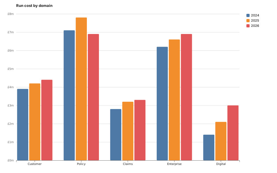
Grouped bar — category comparison.d3

Category comparison. Unglamorous, and usually the right answer.

Grouped bar — category comparison: rendered example
Show the source
// Grouped bar chart — the workhorse. Two band scales: an outer one for
// the group, an inner one keyed to the series, positioned inside the outer
// band's width.

const seriesKeys = ['2024', '2025', '2026'];
const data = [
  { group: 'Customer',   '2024': 3.9, '2025': 4.2, '2026': 4.4 },
  { group: 'Policy',     '2024': 7.1, '2025': 7.8, '2026': 6.9 },
  { group: 'Claims',     '2024': 2.8, '2025': 3.2, '2026': 3.3 },
  { group: 'Enterprise', '2024': 6.2, '2025': 6.6, '2026': 6.9 },
  { group: 'Digital',    '2024': 1.4, '2025': 2.1, '2026': 3.0 },
];

const margin = { top: 48, right: 130, bottom: 44, left: 56 };

const x0 = d3.scaleBand()
    .domain(data.map(d => d.group))
    .range([margin.left, width - margin.right])
    .paddingInner(0.2);
const x1 = d3.scaleBand()
    .domain(seriesKeys)
    .range([0, x0.bandwidth()])
    .padding(0.08);
const y = d3.scaleLinear()

The rest of this template, and how to use it

Multi-line — metrics over time.d3

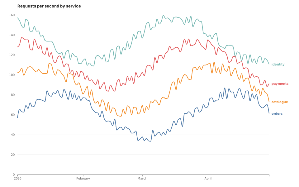
Metrics over time. Keep it under about five series, or switch to horizon.

Multi-line — metrics over time: rendered example
Show the source
// Multi-line time series with labels at the line ends rather than a
// legend — the reader never has to match a colour swatch to a line.

const rng = d3.randomLcg(17);
const names = ['orders', 'catalogue', 'payments', 'identity'];
const start = new Date(Date.UTC(2026, 0, 1));
const days = d3.utcDay.range(start, d3.utcDay.offset(start, 120));

const series = names.map((name, i) => ({
  name,
  values: days.map((date, t) => ({
    date,
    value: Math.max(1, 60 + i * 25 + 22 * Math.sin((t + i * 9) / 13) + rng() * 12 - 6),
  })),
}));

const margin = { top: 48, right: 96, bottom: 40, left: 56 };

const x = d3.scaleUtc()
    .domain(d3.extent(days))
    .range([margin.left, width - margin.right]);
const y = d3.scaleLinear()
    .domain([0, d3.max(series, s => d3.max(s.values, v => v.value))]).nice()
    .range([height - margin.bottom, margin.top]);

The rest of this template, and how to use it

Render these offline

Every template here ships in Gnomon and renders on your machine, with no account and nothing sent to a server. The browser editor is free and needs no install.

Get GnomonOpen the browser editor