Beeswarm
distribution by group
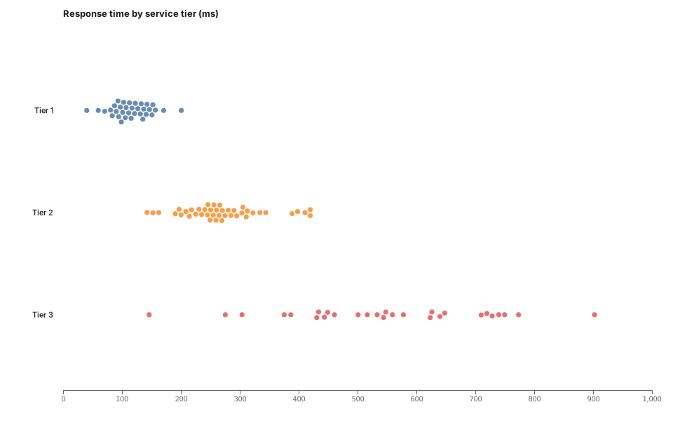
Every point, grouped, without the overplotting a strip plot suffers.
- Format.d3
- Length79 lines
- Includesnone
The source
79 lines of D3 JavaScript, and uses only the bundled D3 build. Copy it, or open the template inside Gnomon and render it as it is.
// Beeswarm — every observation plotted, nudged apart so none hides
// another. A box plot shows you the summary; this shows you the shape,
// including the two outliers a box plot would reduce to dots.

const rng = d3.randomLcg(23);
const normal = d3.randomNormal.source(rng);
const groups = [
  { name: 'Tier 1', mu: 120, sigma: 30, n: 34 },
  { name: 'Tier 2', mu: 260, sigma: 70, n: 42 },
  { name: 'Tier 3', mu: 520, sigma: 160, n: 28 },
];

const points = groups.flatMap(g => {
  const draw = normal(g.mu, g.sigma);
  return d3.range(g.n).map(() => ({ group: g.name, value: Math.max(20, draw()) }));
});

const margin = { top: 40, right: 30, bottom: 44, left: 90 };
const x = d3.scaleLinear()
    .domain([0, d3.max(points, d => d.value)]).nice()
    .range([margin.left, width - margin.right]);
const y = d3.scalePoint()
    .domain(groups.map(g => g.name))
    .range([margin.top + 30, height - margin.bottom - 20])
    .padding(0.6);
const color = d3.scaleOrdinal(groups.map(g => g.name), theme.palette);

// The dodge: pin each point to its x, pull it to its group's y, and let
// collision push the pile apart. Ticked synchronously so it is reproducible.
const sim = d3.forceSimulation(points)
    .force('x', d3.forceX(d => x(d.value)).strength(1))
    .force('y', d3.forceY(d => y(d.group)).strength(0.35))
    .force('collide', d3.forceCollide(4.2))
    .randomSource(rng);
sim.stop();
for (let i = 0; i < 220; i++) sim.tick();

const svg = d3.select(container).append('svg')
    .attr('viewBox', [0, 0, width, height])
    .attr('width', width)
    .attr('height', height)
    .attr('font-family', 'system-ui, sans-serif')
    .attr('font-size', 11);

svg.append('g')
    .attr('transform', `translate(0,${height - margin.bottom})`)
    .call(d3.axisBottom(x).ticks(8))
    .call(g => g.select('.domain').attr('stroke', theme.muted))
    .call(g => g.selectAll('text').attr('fill', theme.muted))
    .call(g => g.selectAll('line').attr('stroke', theme.muted));

svg.append('g')
    .attr('fill', theme.foreground)
    .attr('text-anchor', 'end')
  .selectAll('text')
  .data(groups)
  .join('text')
    .attr('x', margin.left - 14)
    .attr('y', d => y(d.name))
    .attr('dy', '0.35em')
    .text(d => d.name);

svg.append('g')
  .selectAll('circle')
  .data(points)
  .join('circle')
    .attr('cx', d => d.x)
    .attr('cy', d => d.y)
    .attr('r', 3.6)
    .attr('fill', d => color(d.group))
    .attr('fill-opacity', 0.85);

svg.append('text')
    .attr('x', margin.left)
    .attr('y', 24)
    .attr('fill', theme.foreground)
    .attr('font-size', 13)
    .attr('font-weight', 600)
    .text('Response time by service tier (ms)');
Render this offline
This template ships in Gnomon and renders on your machine, with no account and nothing sent to a server. The browser editor is free and needs no install.
Others in D3 visualisations
- Sankey — request flowFlow with volume. The best chart here for "where does it all go".
- Chord — service interactionWho talks to whom, when the traffic is bidirectional.
- Arc diagram — dependenciesNodes on one axis, arcs above. Readable where a force graph is not, provided the ordering means something.
- Adjacency matrix — couplingAdjacency matrix. Unfashionable, and better than a force graph for dense dependencies.
- Edge bundling — module importsHierarchical edge bundling. For import graphs big enough that straight edges become a hairball.
- Sunburst — nested spendNested hierarchy, radially. Prettier than an icicle, harder to compare.
- Icicle — nested spend (linear)A sunburst unrolled flat. Harder to love, much easier to compare siblings.
- Circle packing — nested sizeCircle packing. Nested size when the nesting matters more than reading exact areas.
- Treemap — portfolio costNested size. Good for cost, storage, lines of code.
- Tidy tree — structureA tidy tree. The default for anything with one parent per node.
- Radial tree — structure (radial)The same tree bent into a circle. Fits more depth on a slide, costs you easy comparison.
- Dendrogram — clusteringClustering, with join height carrying the distance. Not merely a tree with curves.
- Indented tree — file/spec outlineA file or spec outline. The chart that looks like the thing it describes.
- Force graph — service mapService map. Use for clusters, not for reading individual edges.
- Force graph — disjoint clustersForce graph that keeps unconnected clusters apart rather than flinging them off screen.
- Force graph — radial tiersForce layout pinned to rings, so tier is a position instead of a colour legend.
- Directed graph — call directionDirected edges with arrowheads. For when direction is the question, not just adjacency.
- Force tree — blast radiusBlast radius from one node: what breaks if this goes.
- Calendar heatmap — daily activityDaily activity over a year: deploys, incidents, commits.
- Streamgraph — shifting mixShifting composition over time. Good for the mix, poor for reading any single value.
- Gantt — delivery roadmapDelivery roadmap, rendered from data.
- Radar — capability scoringCapability scoring across axes. Fine for one subject, misleading with four overlaid.
- Bullet chart — target vs actualTarget against actual, in one line. The chart a gauge wishes it were.
- Horizon chart — many series, little spaceMany series in little space. Takes a moment to learn, then very dense.
- Slope chart — before and afterBefore and after, two points, one line each. Devastatingly clear.
- Parallel coordinates — multi-criteriaMulti-criteria comparison: for option analysis.
- Box plot — latency distributionLatency distribution. The chart that shows the tail a mean hides.
- Grouped bar — category comparisonCategory comparison. Unglamorous, and usually the right answer.
- Multi-line — metrics over timeMetrics over time. Keep it under about five series, or switch to horizon.