Gantt
delivery roadmap
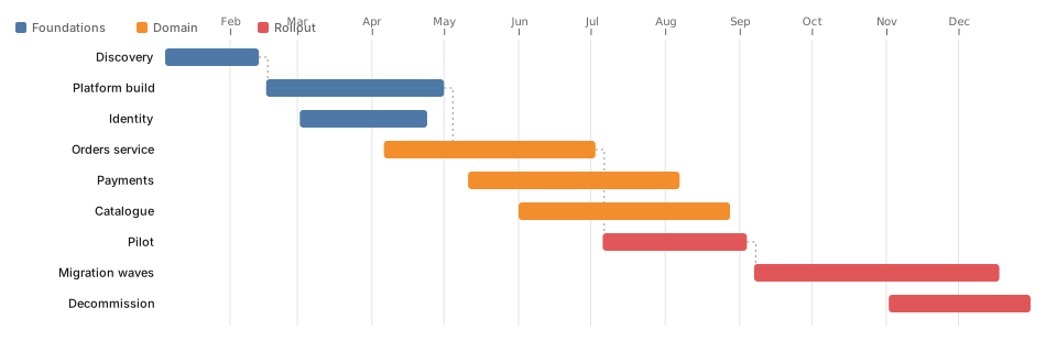
Delivery roadmap, rendered from data.
- Format.d3
- Length111 lines
- Includesnone
The source
111 lines of D3 JavaScript, and uses only the bundled D3 build. Copy it, or open the template inside Gnomon and render it as it is.
// Gantt / roadmap — bars on a time axis, grouped by workstream.
// Dependencies are drawn as elbow connectors, which is what separates a
// roadmap from a list of coloured rectangles.

const tasks = [
  { id: 'discovery', stream: 'Foundations', label: 'Discovery',        start: '2026-01-05', end: '2026-02-13' },
  { id: 'platform',  stream: 'Foundations', label: 'Platform build',   start: '2026-02-16', end: '2026-05-01', after: 'discovery' },
  { id: 'identity',  stream: 'Foundations', label: 'Identity',         start: '2026-03-02', end: '2026-04-24' },

  { id: 'orders',    stream: 'Domain',      label: 'Orders service',   start: '2026-04-06', end: '2026-07-03', after: 'platform' },
  { id: 'payments',  stream: 'Domain',      label: 'Payments',         start: '2026-05-11', end: '2026-08-07' },
  { id: 'catalogue', stream: 'Domain',      label: 'Catalogue',        start: '2026-06-01', end: '2026-08-28' },

  { id: 'pilot',     stream: 'Rollout',     label: 'Pilot',            start: '2026-07-06', end: '2026-09-04', after: 'orders' },
  { id: 'migrate',   stream: 'Rollout',     label: 'Migration waves',  start: '2026-09-07', end: '2026-12-18', after: 'pilot' },
  { id: 'decomm',    stream: 'Rollout',     label: 'Decommission',     start: '2026-11-02', end: '2026-12-31' },
];

const parse = s => new Date(s + 'T00:00:00Z');
const rows = tasks.map((t, i) => ({ ...t, index: i, s: parse(t.start), e: parse(t.end) }));
const byId = new Map(rows.map(r => [r.id, r]));

const margin = { top: 44, right: 24, bottom: 24, left: 150 };
const rowHeight = 28;
const barHeight = 16;
const boxHeight = margin.top + rows.length * rowHeight + margin.bottom;

const x = d3.scaleTime()
    .domain([d3.min(rows, d => d.s), d3.max(rows, d => d.e)])
    .range([margin.left, width - margin.right]);

const streams = Array.from(new Set(rows.map(d => d.stream)));
const color = d3.scaleOrdinal(streams, theme.palette);
const y = d => margin.top + d.index * rowHeight;

const svg = d3.select(container).append('svg')
    .attr('viewBox', [0, 0, width, boxHeight])
    .attr('width', width)
    .attr('height', boxHeight)
    .attr('font-family', 'system-ui, sans-serif')
    .attr('font-size', 11);

// Month gridlines behind everything — a roadmap without them is unreadable.
svg.append('g')
    .attr('stroke', theme.muted)
    .attr('stroke-opacity', 0.18)
  .selectAll('line')
  .data(x.ticks(d3.utcMonth))
  .join('line')
    .attr('x1', d => x(d)).attr('x2', d => x(d))
    .attr('y1', margin.top - 8)
    .attr('y2', boxHeight - margin.bottom);

svg.append('g')
    .attr('transform', `translate(0,${margin.top - 12})`)
    .call(d3.axisTop(x).ticks(d3.utcMonth).tickFormat(d3.utcFormat('%b')))
    .call(g => g.select('.domain').remove())
    .call(g => g.selectAll('text').attr('fill', theme.muted))
    .call(g => g.selectAll('line').attr('stroke', theme.muted));

svg.append('g')
    .attr('fill', 'none')
    .attr('stroke', theme.muted)
    .attr('stroke-opacity', 0.7)
    .attr('stroke-dasharray', '2,3')
  .selectAll('path')
  .data(rows.filter(d => d.after && byId.has(d.after)))
  .join('path')
    .attr('d', d => {
      const from = byId.get(d.after);
      const fx = x(from.e);
      const fy = y(from) + barHeight / 2;
      const tx = x(d.s);
      const ty = y(d) + barHeight / 2;
      const mid = fx + Math.max(8, (tx - fx) / 2);
      return `M${fx},${fy}H${mid}V${ty}H${tx}`;
    });

const row = svg.append('g')
  .selectAll('g')
  .data(rows)
  .join('g')
    .attr('transform', d => `translate(0,${y(d)})`);

row.append('rect')
    .attr('x', d => x(d.s))
    .attr('width', d => Math.max(2, x(d.e) - x(d.s)))
    .attr('height', barHeight)
    .attr('rx', 3)
    .attr('fill', d => color(d.stream));

row.append('text')
    .attr('x', margin.left - 10)
    .attr('y', barHeight / 2)
    .attr('dy', '0.35em')
    .attr('text-anchor', 'end')
    .attr('fill', theme.foreground)
    .text(d => d.label);

svg.append('g')
    .attr('transform', 'translate(14,20)')
  .selectAll('g')
  .data(streams)
  .join('g')
    .attr('transform', (_, i) => `translate(${i * 110},0)`)
    .call(g => g.append('rect')
        .attr('width', 10).attr('height', 10).attr('rx', 2)
        .attr('fill', d => color(d)))
    .call(g => g.append('text')
        .attr('x', 15).attr('y', 9)
        .attr('fill', theme.muted).text(d => d));
Render this offline
This template ships in Gnomon and renders on your machine, with no account and no diagram uploads. The browser editor is free and needs no install.
Others in D3 visualisations
- Sankey — request flowFlow with volume. The best chart here for "where does it all go".
- Chord — service interactionWho talks to whom, when the traffic is bidirectional.
- Arc diagram — dependenciesNodes on one axis, arcs above. Readable where a force graph is not, provided the ordering means something.
- Adjacency matrix — couplingAdjacency matrix. Unfashionable, and better than a force graph for dense dependencies.
- Edge bundling — module importsHierarchical edge bundling. For import graphs big enough that straight edges become a hairball.
- Sunburst — nested spendNested hierarchy, radially. Prettier than an icicle, harder to compare.
- Icicle — nested spend (linear)A sunburst unrolled flat. Harder to love, much easier to compare siblings.
- Circle packing — nested sizeCircle packing. Nested size when the nesting matters more than reading exact areas.
- Treemap — portfolio costNested size. Good for cost, storage, lines of code.
- Tidy tree — structureA tidy tree. The default for anything with one parent per node.
- Radial tree — structure (radial)The same tree bent into a circle. Fits more depth on a slide, costs you easy comparison.
- Dendrogram — clusteringClustering, with join height carrying the distance. Not merely a tree with curves.
- Indented tree — file/spec outlineA file or spec outline. The chart that looks like the thing it describes.
- Force graph — service mapService map. Use for clusters, not for reading individual edges.
- Force graph — disjoint clustersForce graph that keeps unconnected clusters apart rather than flinging them off screen.
- Force graph — radial tiersForce layout pinned to rings, so tier is a position instead of a colour legend.
- Directed graph — call directionDirected edges with arrowheads. For when direction is the question, not just adjacency.
- Force tree — blast radiusBlast radius from one node: what breaks if this goes.
- Calendar heatmap — daily activityDaily activity over a year: deploys, incidents, commits.
- Streamgraph — shifting mixShifting composition over time. Good for the mix, poor for reading any single value.
- Radar — capability scoringCapability scoring across axes. Fine for one subject, misleading with four overlaid.
- Bullet chart — target vs actualTarget against actual, in one line. The chart a gauge wishes it were.
- Beeswarm — distribution by groupEvery point, grouped, without the overplotting a strip plot suffers.
- Horizon chart — many series, little spaceMany series in little space. Takes a moment to learn, then very dense.
- Slope chart — before and afterBefore and after, two points, one line each. Devastatingly clear.
- Parallel coordinates — multi-criteriaMulti-criteria comparison: for option analysis.
- Box plot — latency distributionLatency distribution. The chart that shows the tail a mean hides.
- Grouped bar — category comparisonCategory comparison. Unglamorous, and usually the right answer.
- Multi-line — metrics over timeMetrics over time. Keep it under about five series, or switch to horizon.