GKE, Cloud Run, BigQuery: the shapes GCP actually gets used in.
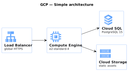
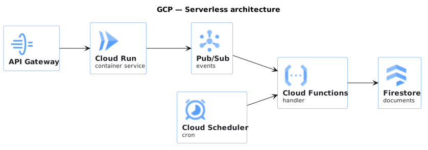
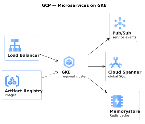
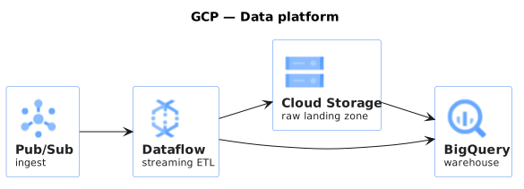
Google Cloud architectures drawn with the official product icons. The value of an icon set here is not decoration, it is that a reviewer can tell Cloud Run from GKE at a glance, and those two choices have very different operational costs.
GCP's service names change less often than its competitors' do, which makes these diagrams age better than most cloud drawings.
When to use these
Proposing a GCP design to people who will recognise the products by their icons.
Comparing a serverless shape against a GKE one, where the difference is the point.
Documenting what a project actually runs, before someone asks why the bill moved.
When not to
Multi-cloud designs, where one vendor icon set quietly implies a default.
Anything where the reader cares about the flow rather than the products. Use a sequence diagram.
Common mistakes
The common mistake is drawing every managed service as a box of the same size, which hides that one of them is the entire data plane and the rest are configuration. Size and grouping should say something.
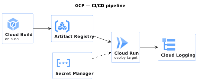
Cloud Build and Artifact Registry. The path from commit to running service.
Show the source
@startuml
!include <gcp/GCPCommon>
!include <gcp/cloud_build>
!include <gcp/artifact_registry>
!include <gcp/cloud_run>
!include <gcp/secret_manager>
!include <gcp/cloud_logging>

title GCP — CI/CD pipeline

left to right direction

GCP_CLOUD_BUILD(build, "Cloud Build", "on push")
GCP_ARTIFACT_REGISTRY(ar, "Artifact Registry")
GCP_CLOUD_RUN(run, "Cloud Run", "deploy target")
GCP_SECRET_MANAGER(sm, "Secret Manager")
GCP_CLOUD_LOGGING(log, "Cloud Logging")

build --> ar
ar --> run
sm ..> run
run --> log
@enduml
Every template here ships in Gnomon and renders on your machine, with no account and nothing sent to a server. The browser editor is free and needs no install.